The world is on fire. In the scope of things Schrofer’s ‘strange little letters’ and my musings on them might not seem to many to amount to much. But good and thoughtful work, celebrated and pursued honestly, in the face of so much stupidity and cruelty can be its own form of activism. It might not be given to us change the world, but we can always serve the values that make life in that world worth living.
Post
**01**
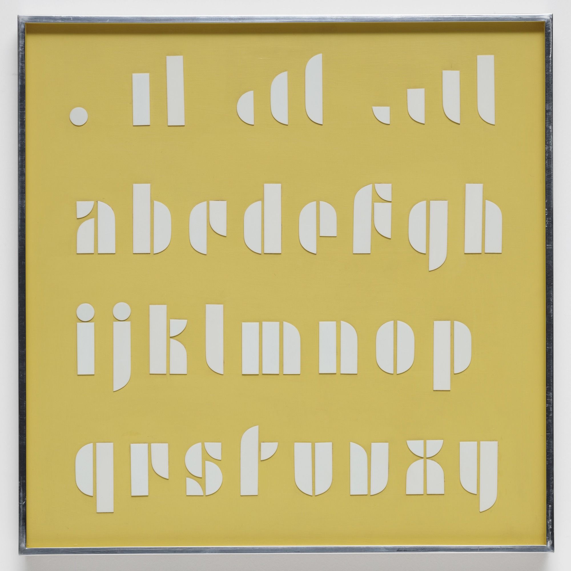
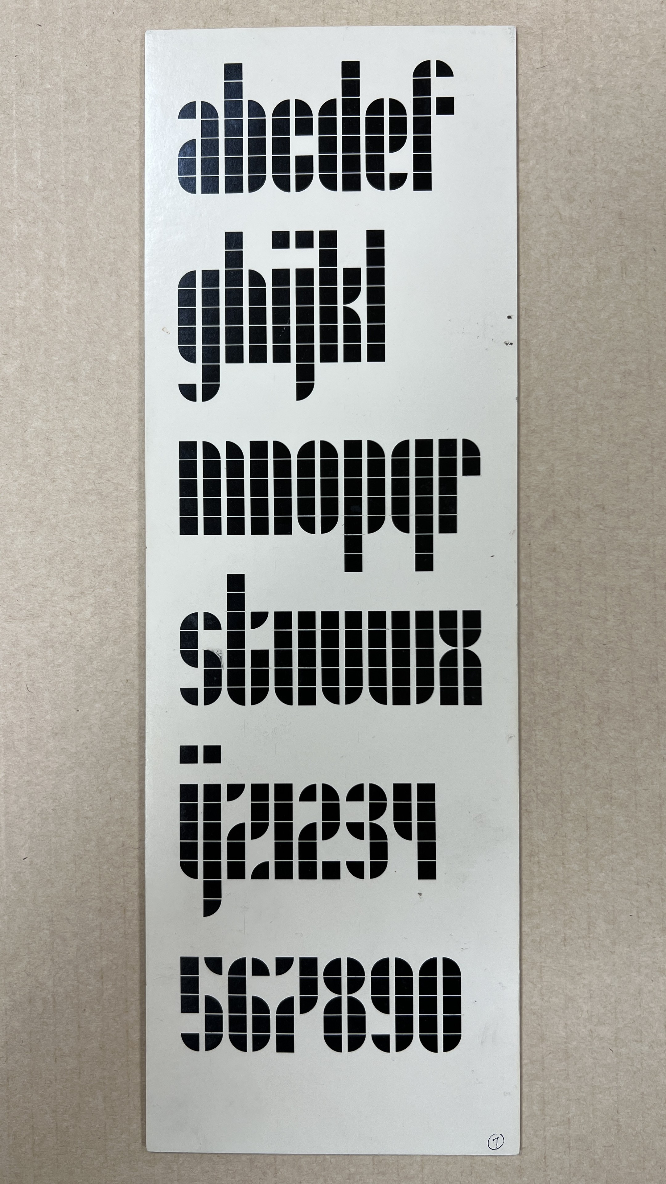
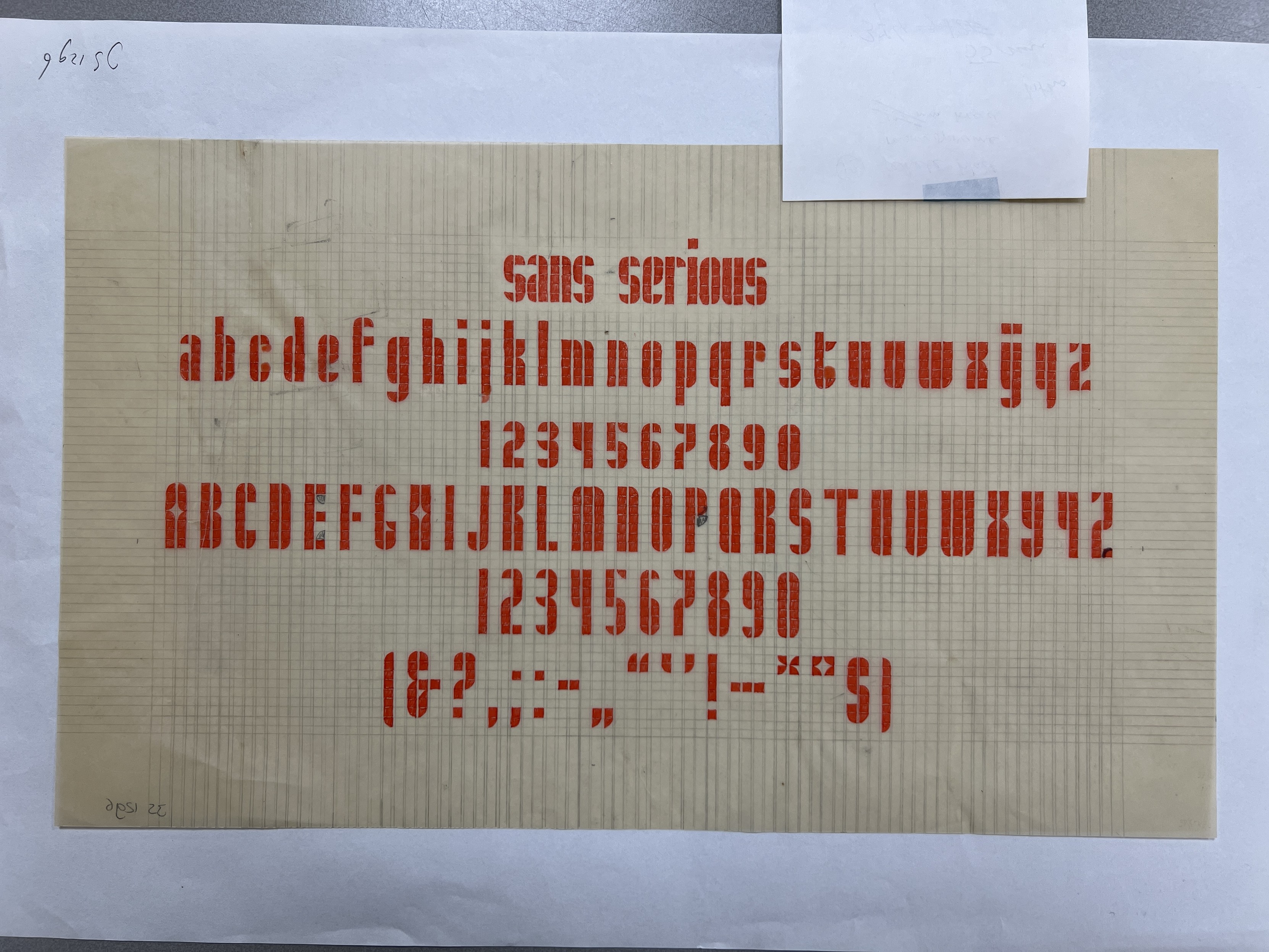
In 1962 Jurriaan Schrofer began teaching courses at Amsterdam’s Instituut voor Kunstnijverheidsonderwijs (Institute for Applied Arts Education, renamed in 1968 the Gerrit Rietveld Academie). He asked fourth-year students in one of his classes to make an alphabet ‘with as few building blocks as possible’. Not satisfied with their results—as he told the story to Hans Vonk in Qwerty Magazine in 1990—he decided to try the assignment himself.
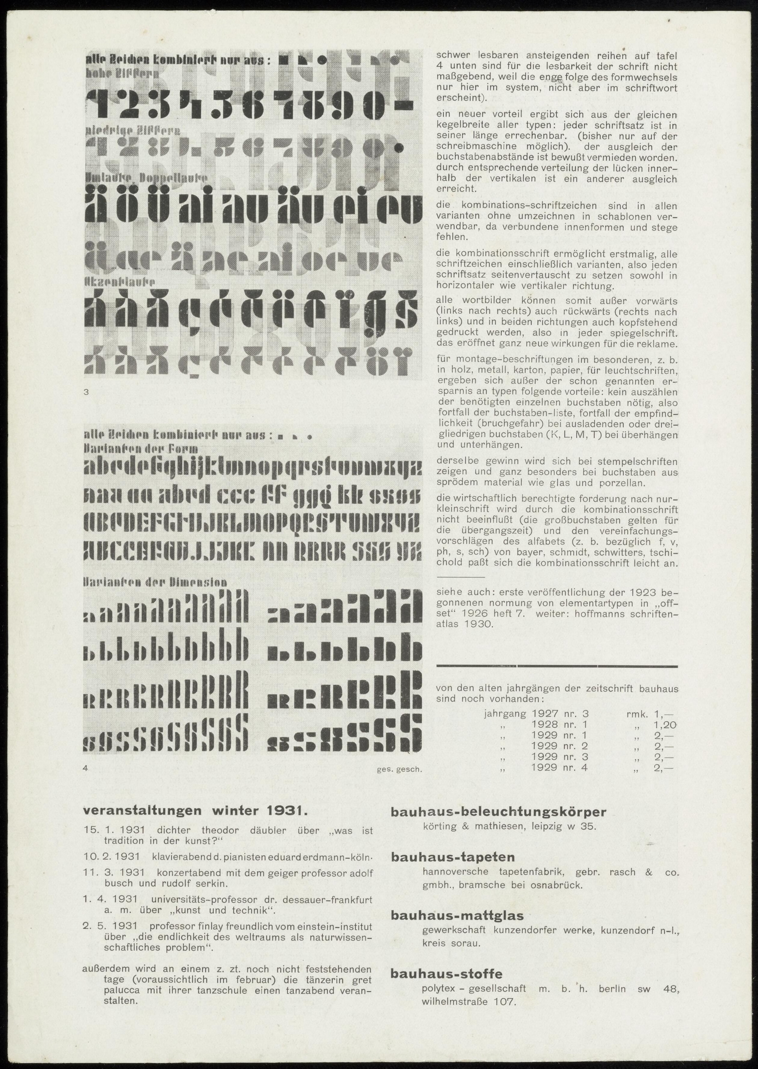
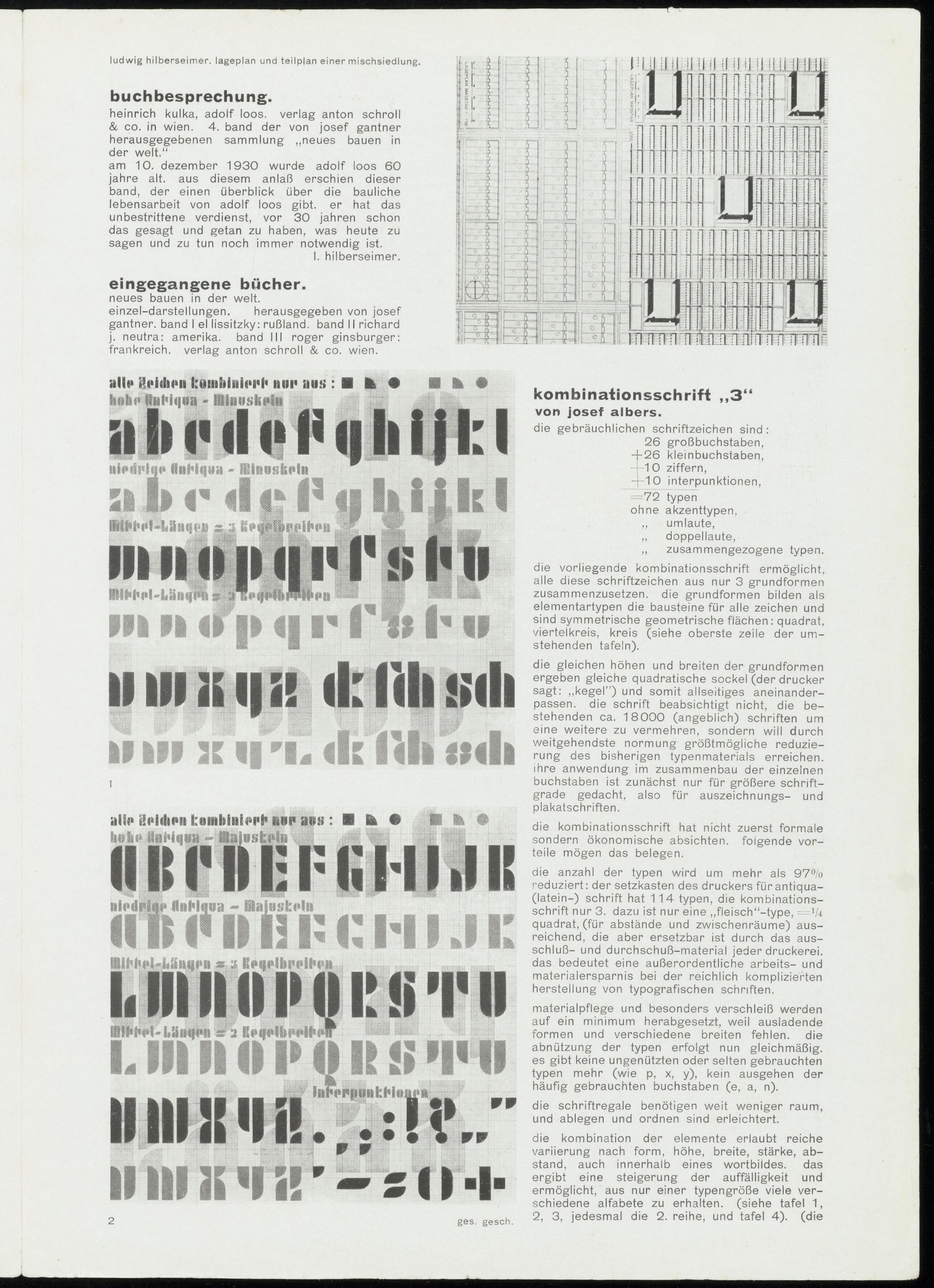
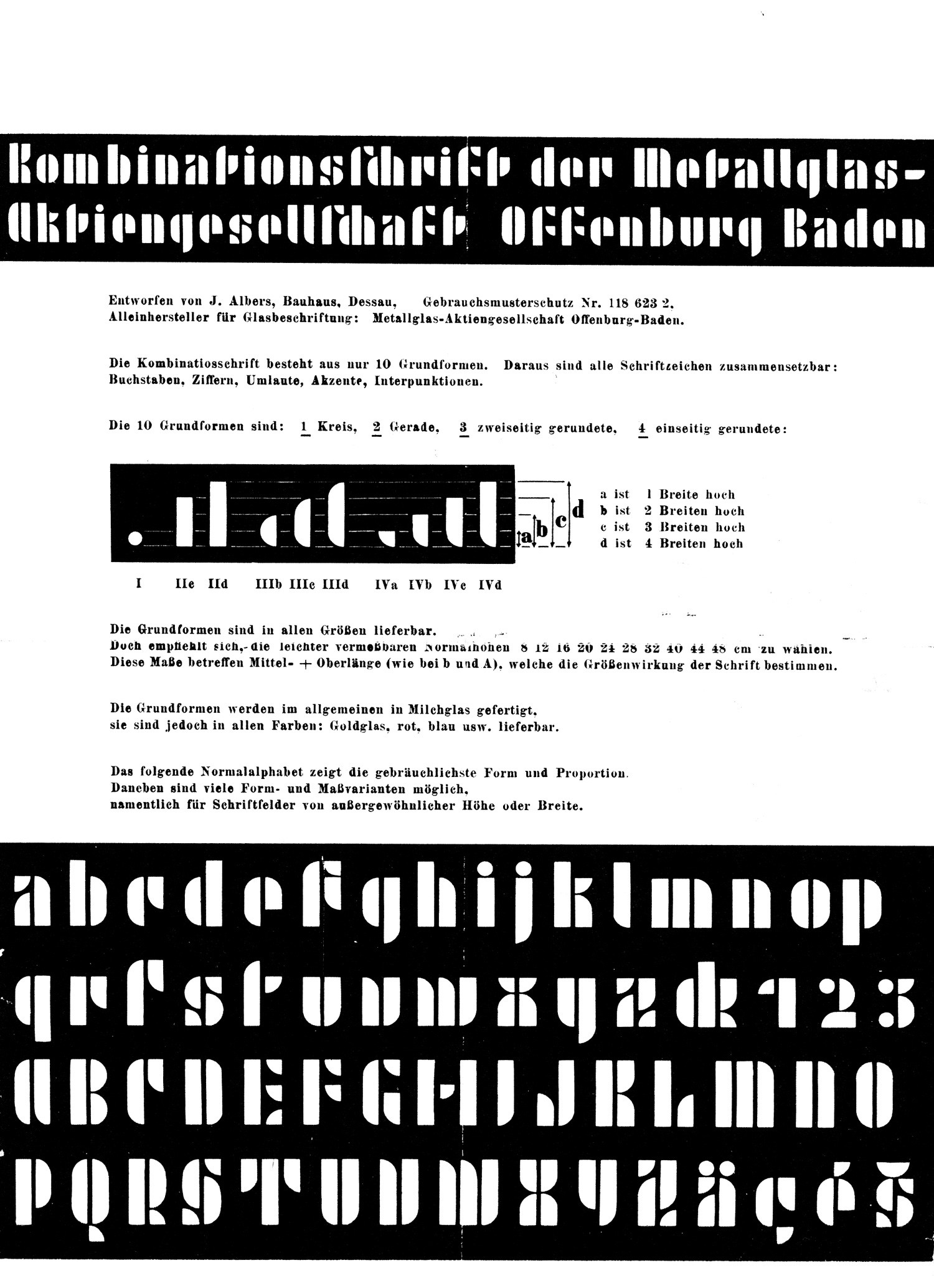
Schrofer’s design, a combination of squares and quarter-circles in a column grid, was—in his words—‘not that original at all’, similar to ‘alphabets made in the 1920s and 1930s’. He was thinking of Kombinationsschrift, a series of lettering designs by Josef Albers. Albers first developed his alphabet in 1923 as lettering for a metal and glass manufacturer in Offenburg; the final versions for letterpress he showed in the January 1931 issue of Bauhaus.
Note that Albers parses the structure and process of making his letterforms in two different ways. The earlier version he describes as being built of combinations of ten basic forms; the later version, of just three simpler ones.
Note also the variations Albers explores with the second version. That designs can be parsed in different ways, and their parameters varied accordingly, are features of all Schrofer’s designs, and of constructed scripts generally.
Schrofer named his own design ’Sans Serious’. Its lack of originality didn’t disturb him—as he explained to Vonk and in LOM, designers working with geometric shapes in constrained design spaces were bound to find convergent solutions.
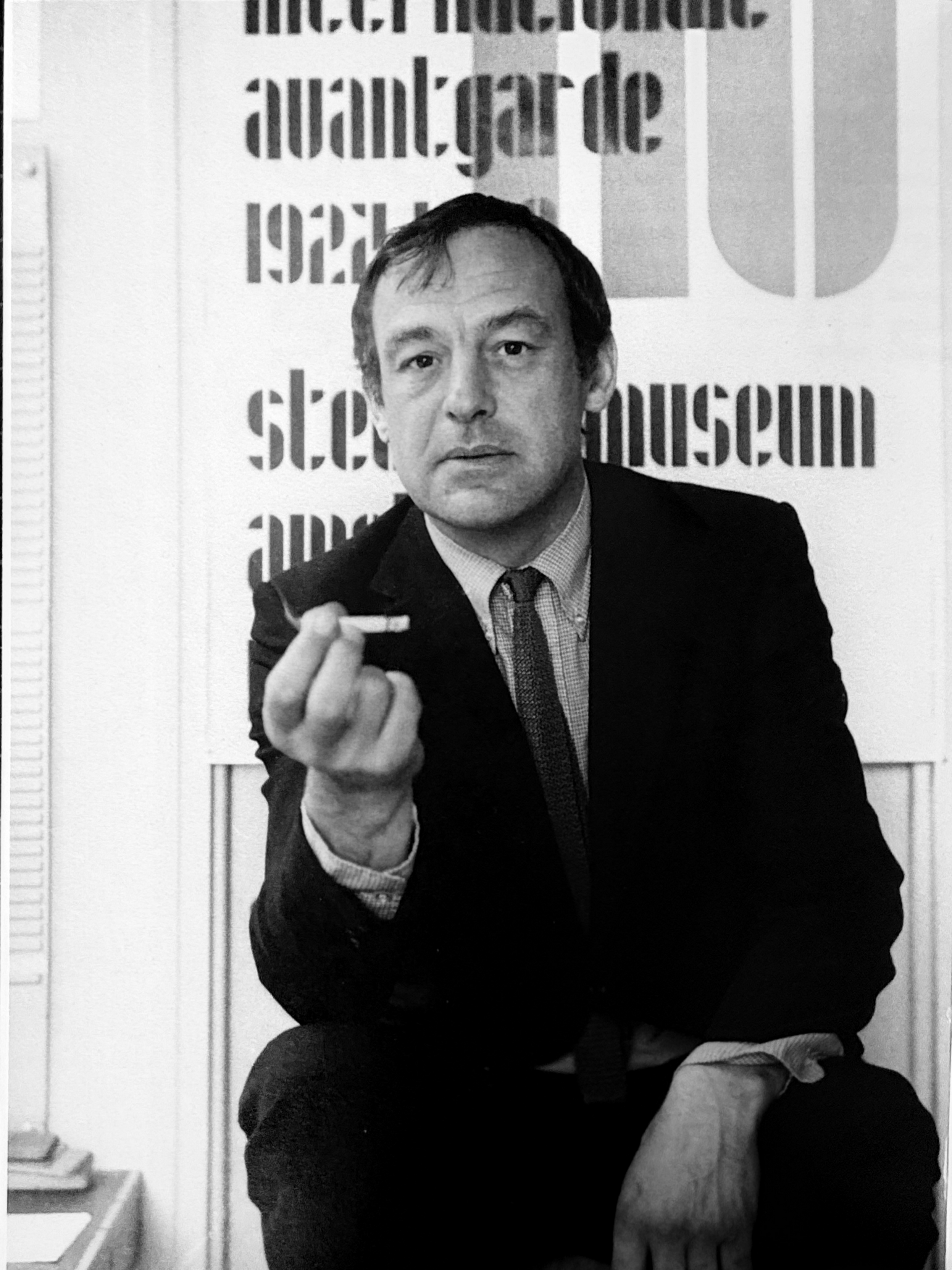
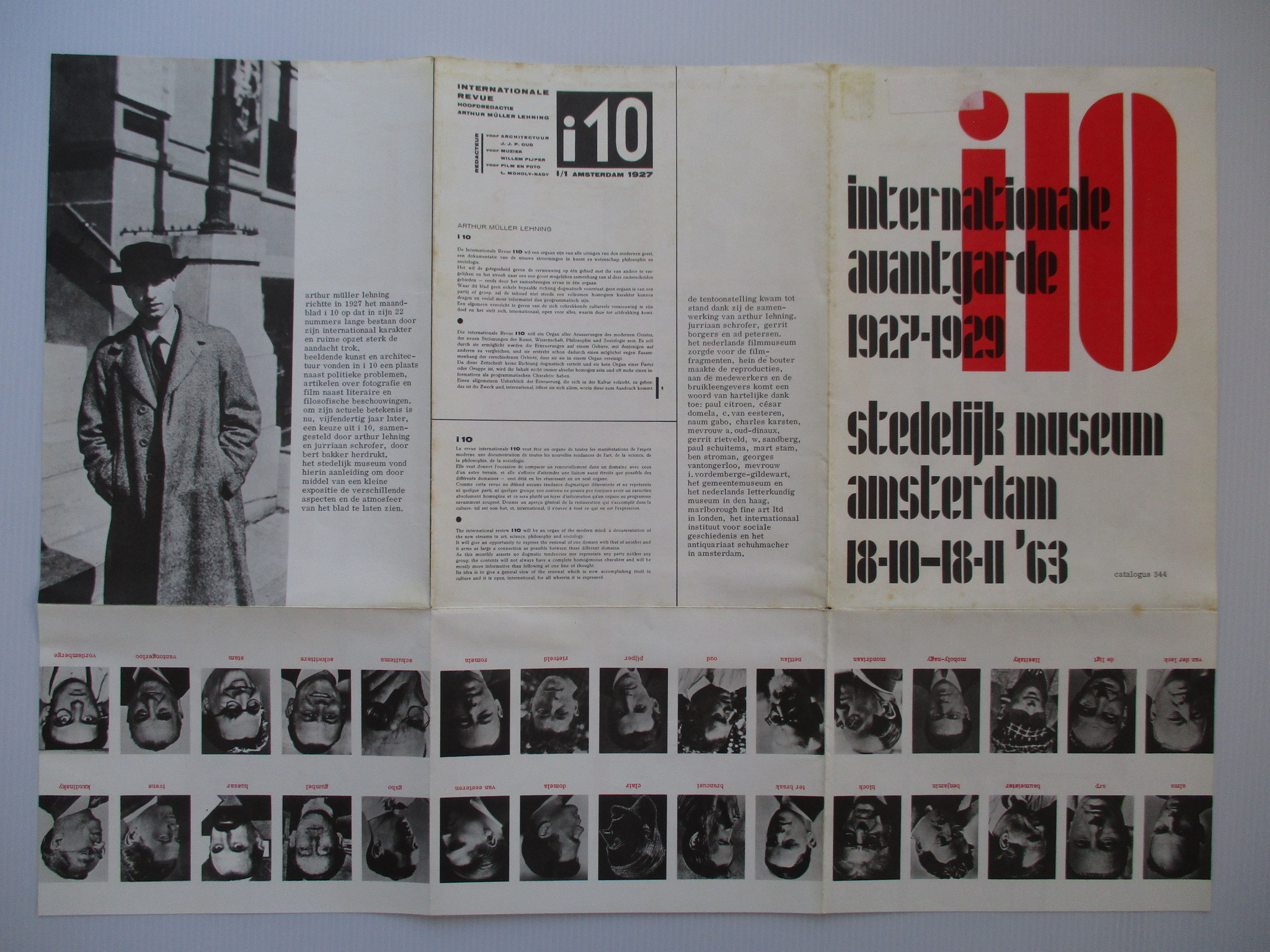
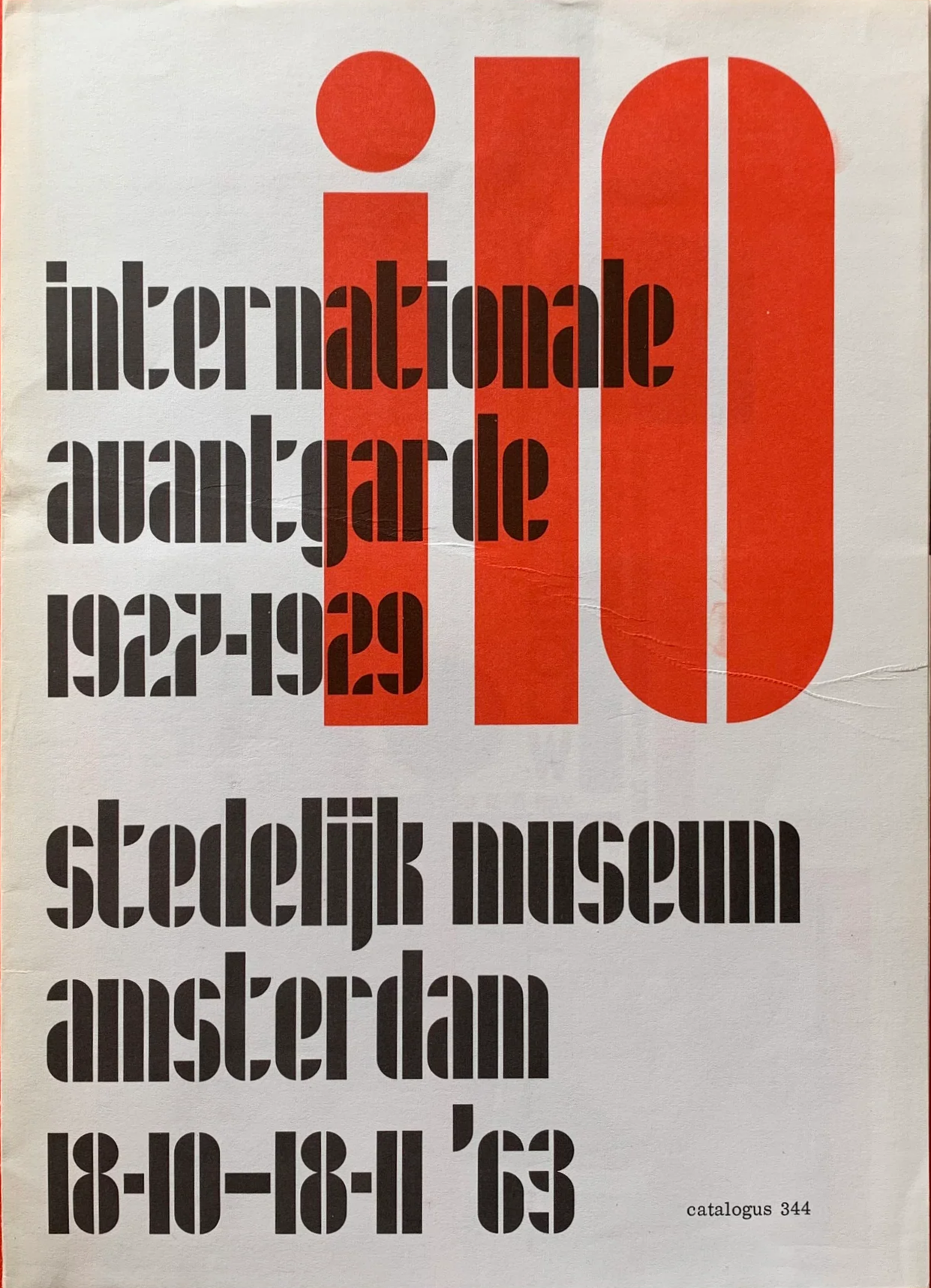
Schrofer was soon afterwards approached to design the catalog for a 1963 exhibition on the interwar art and design journal i10 at the Stedelijk Museum in Amsterdam. Schrofer built the design around his script, which became the foundation for all the publicity materials for the show. (That’s Schrofer in front of his poster.)
Vihāra
Vihāra is an experimental Buddhist monastery: a federated hub representing the activities of a Buddhist monastery in the Himalayan Vajrayāna/Mahāyāna lineages.
